
Project overview
Good Housing Co – a Hawke's Bay property developer – needed an identity that felt grounded and trustworthy.
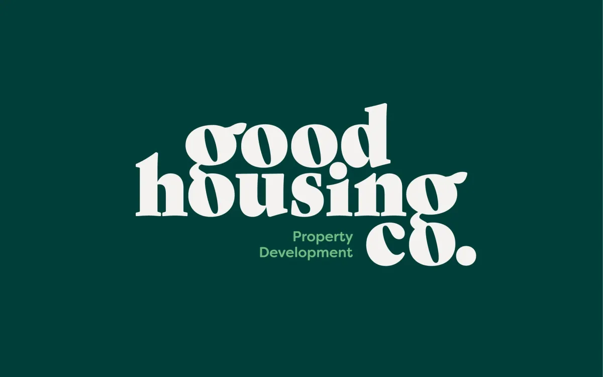
Leaves integrated into the g's reinforce the "good" in the name and nod to Hawke's Bay – the fruit bowl of New Zealand. The combined g's and o's signify community connection while keeping the mark visually uncluttered.
A serif treatment gives a considered, boutique feel, and the lowercase keeps it friendly. The deep pine green underscores the established, credible feel.
"Property Development" tucks in neatly – a friendly pop of bright green that drops away cleanly at smaller sizes where it wouldn't stay legible.