Project overview
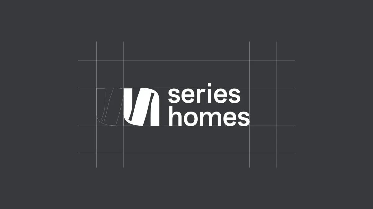
The challenge was to build a brand identity that mirrors the company's ethos: bold structural integrity balanced with refined simplicity.
We researched key influences from the materials used in their modular builds, the sharpness of steel, it's form, it's strength, and explored how to portray this within in icon, and identity.
The resulting visual system pairs a humble, utilitarian sans-serif with a structural icon that references raw steel. Complemented by fluid editorial curves the identity delivers a minimal yet deeply characterful brand presence.