
The project
Project overview
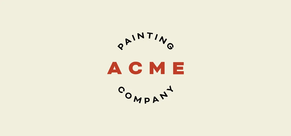
For any service-based trade, one of the biggest barriers is often uncertainty. Customer touchpoints are fleeting; a van, an instagram ad, exterior signage on the job. Defining a clear brand identity for Acme Painting Company would be pivotal: it needed to establish legitimacy and represent quality, alleviating any of the concerns potential new customers may have. The identity for Acme blends elements of traditional craftsmanship and modern precision, drawing inspiration from the heritage feel of mid-century trade emblems.
Typography encircles the company name in wide letterforms with exaggerated tracking. A block typeface recalls the strokes of a brush or roller: clean, confident, and professional. The palette of brick red, slate grey and sandstone draws from popular colours of heritage homes across the city.
The result is a brand identity that builds credibility from day one, and a visual framework that scales and adapts consistently – from vehicle wraps to digital marketing – as the business grows.
Services & Deliverables
Brand Identity Design
Colour Palette
Favicon
Logo and Logotype
Client feedback
“Hattie brought a consultative, professional approach to every stage of the project, with a clear process and open communication throughout. She created a brand that genuinely stands out among our competitors: it’s centred around craftsmanship and quality, with a modern but timeless aesthetic that matched our vision for the business. We’ve now got a really strong foundation we can grow on – and it’s already built trust with clients in our market.”
Connor Sheehan, owner, Acme Painting Company