Project overview
The challenge
Ūhane Rituals needed a brand identity that could capture the sacred, feminine energy of their practice while remaining modern and approachable. The identity had to feel nurturing yet transformative, reflecting the deep emotional and cultural connection central to their services.
Your approach
Our creative direction was guided by themes of femininity, the sacred, and the rhythm of the ocean, weaving Hawaiian cultural references throughout.
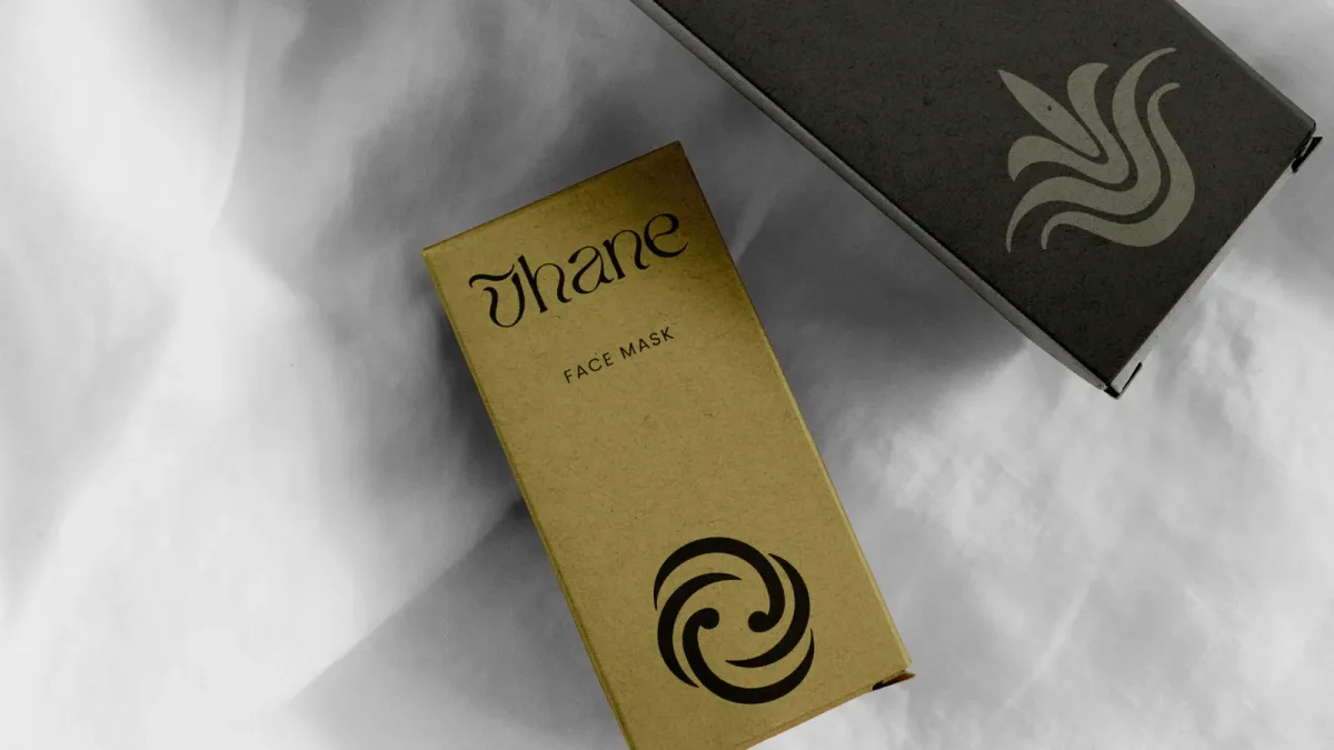
At the core of the identity is a thoughtfully crafted logotype. Each letterform in the primary logo draws inspiration from stages of womanhood—the curves of pregnancy, the womb, and the ever-flowing cycles of life. It was essential that the logotype felt soft yet strong, reflective of the nurturing yet transformative experiences offered by Ūhane Rituals.
Alongside the primary logo, we developed a distinct brandmark: the ‘Ū’ letterform reimagined as a feminine figure. The macron doubles as a wave or flowing hair, anchoring the brand to its Hawaiian roots, and reveals a subtle heart when rotated—a nod to the love and care behind the brand’s mission.
We also designed a suite of custom icons featuring native Hawaiian plants, each chosen for their cultural significance and symbolism in healing, protection, and resilience. Naupaka, Hala, Hāpuʻu, ʻUlu, and Kī create visual storytelling elements to enhance brand collateral and reinforce the brand’s connection to culture and nature.
The result
The Ūhane Rituals brand identity balances sacred femininity with contemporary refinement, giving the brand a visual language that supports its mission of transformation and healing. The logotype, brandmark, and custom iconography together create a cohesive, meaningful identity that resonates with clients and honours Hawaiian traditions.