
Project overview
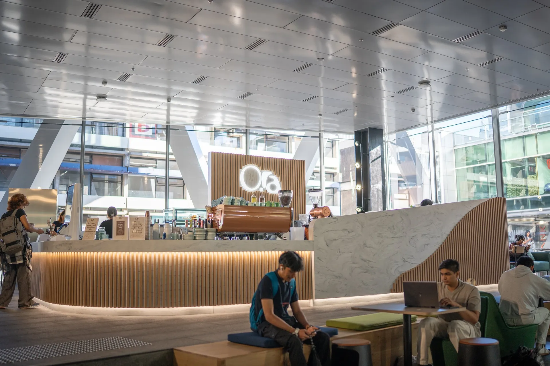
When tasked with naming and creating the branding for the University of Auckland new Recreation Centre café, I wanted to develop something that resonated deeply with its purpose and place. Enter Ora – a name rooted in te reo Māori, meaning to be alive, well, and safe. It’s about thriving, not just surviving. Why Ora? When our ora (wellbeing) is protected, our mauri (life essence) flourishes. The phrase mauri ora reflects this beautifully, capturing the vibrancy of life, the blossoming of potential, and the creation of connections.
The logo design builds on these ideas, weaving cultural meaning with visual harmony: The “R” and “A” interplay like yin and yang, symbolising the balance of fitness and wellness. Food and energy, body and mind – each depends on and supports the other, creating a state of flow. Circular elements in the logo embody balance and connection. The large “O” represents the main Ora Café, while the smaller circle nods to Little Ora, its smaller counterpart on-site. To add a playful touch, I designed a unique pattern featuring stylised icons of people enjoying sports – a nod to the activities within the Recreation Centre. These icons seamlessly extend the Ora brand.