
Case study

Brand Identity for Arlo Restaurant, Cashmere Hill

Sarah-Jane Stringer delivered warm, organic branding for Arlo in Cashmere Hill, with a rounded handwritten logo and hilltop mark that anchors the community.

Brand Identity for Arlo Restaurant, Cashmere Hill

The project

Project overview

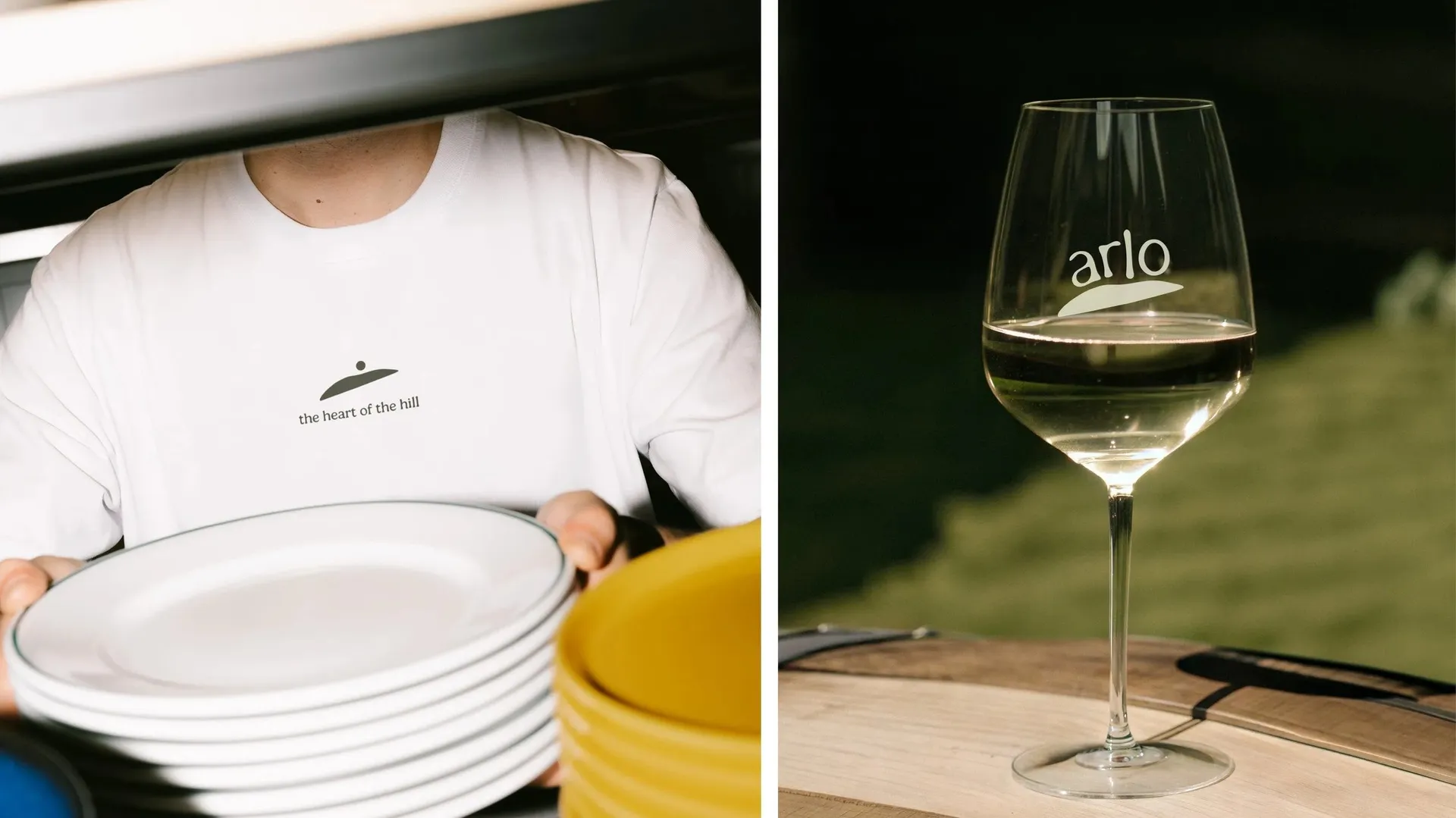
Arlo, affectionately known as “everyone’s favourite neighbour,” is a vibrant new restaurant nestled in the heart of Cashmere Hill, Christchurch. The name 'Arlo,' rooted in Old English and meaning "fortified hill," reflects the venue’s rich connection to its natural surroundings and historical significance as a cultural hub.

The branding captures this essence with a warm, organic feel. A rounded, handwritten typeface conveys a friendly and welcoming vibe, while the logo, perched atop a hill, symbolises Arlo's role as the community's gathering point. Though the font is handwritten, its simplicity and well-balanced spacing ensure a classic, timeless appeal that complements the restaurant's elevated yet casual atmosphere.

Client feedback

"An absolute pleasure from start to finish. Sarah-Jane's exceptional design skills are matched only by her remarkable ability to connect with her clients. She truly understands our vision and consistently delivers results that exceed our expectations. Her turnaround time is impressively swift, perfectly aligned with the fast-paced demands of our industry. Sarah-Jane makes every project a seamless and enjoyable experience. I couldn’t recommend her more highly!"

Tom Newfield - East Block Hospitality