Friendle Mail - Brand Identity
Published on
May 25, 2026
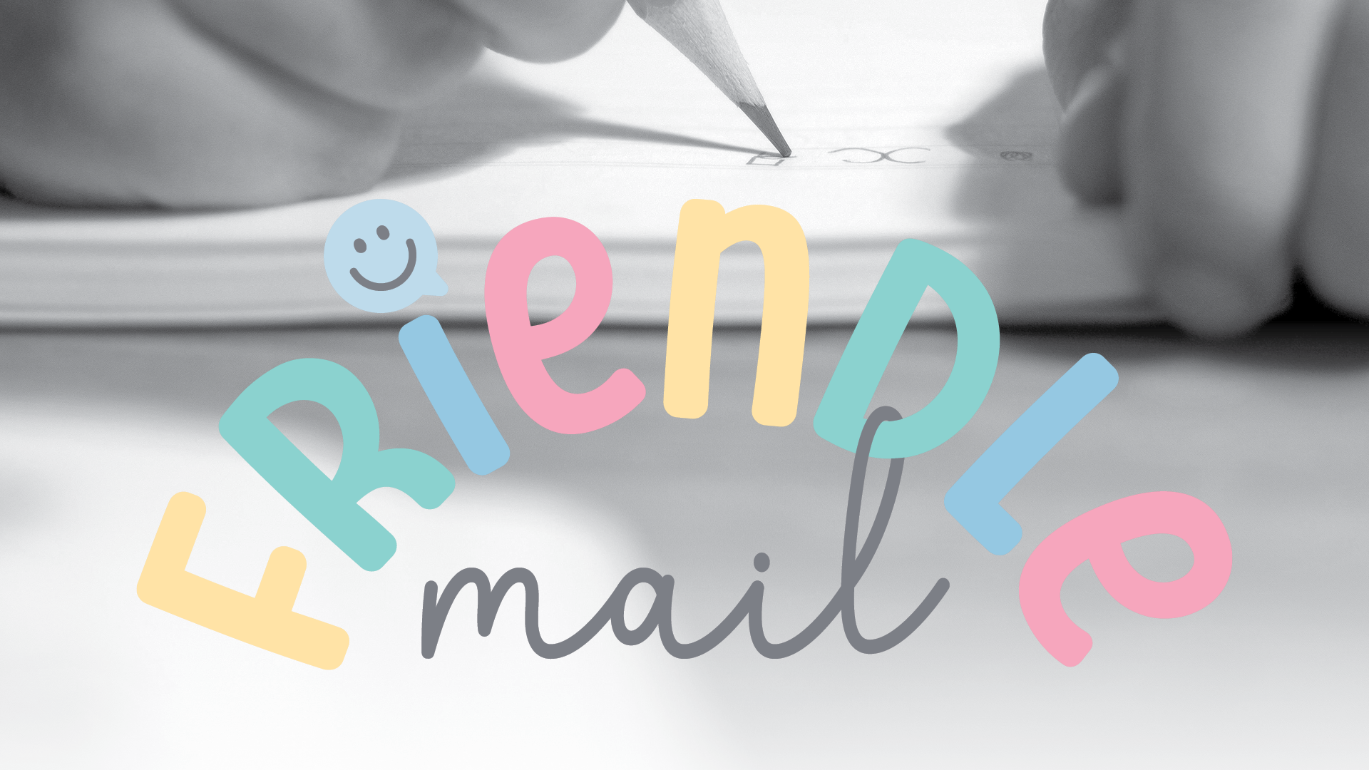


Friendle Mail is an awesome penpal service for Kiwi kids, created by founders Natalie and Georgia to bring back the joy of physical mail in a digital world.
Natalie and Georgia needed a brand identity that felt inclusive, creative, and centered around friendship. The vibe had to be fun and high energy enough for kids to love it, but professional enough for parents to trust it.
I built a playful logo and brand identity system from scratch, focusing on:
- Custom Wordmark: Using fun, rainbow toned type that celebrates diversity.
- Iconography: A little speech bubble highlight tucked into the design to represent connection and communication.
- Brandmark/Favicon: A super friendly, smiley speech bubble mascot holding a colorful envelope, designed to be the face of the brand across their website and social media.
- Color Strategy: A bright, rainbow hued palette to help the brand stand out in a busy kids' market.
Friendle Mail launched with a bright, welcoming look that perfectly matches their mission. The new branding works seamlessly across everything from their physical mailers to their digital platforms, ready for the next generation of Kiwi penpals.