About this project
Emily Witt Property Partners is the newest real estate company to join the Yass Valley, Australia.
Every design choice has been made with purpose — to help the brand stand out in a competitive market through bold typography, confident colour use, and a refined yet approachable aesthetic. The visual direction leans on thoughtful composition and generous negative space, creating a look that feels both timeless and sophisticated. The result is a confident identity that commands attention without unnecessary complexity, bringing a fresh, elevated perspective to the real estate industry.
Icon:
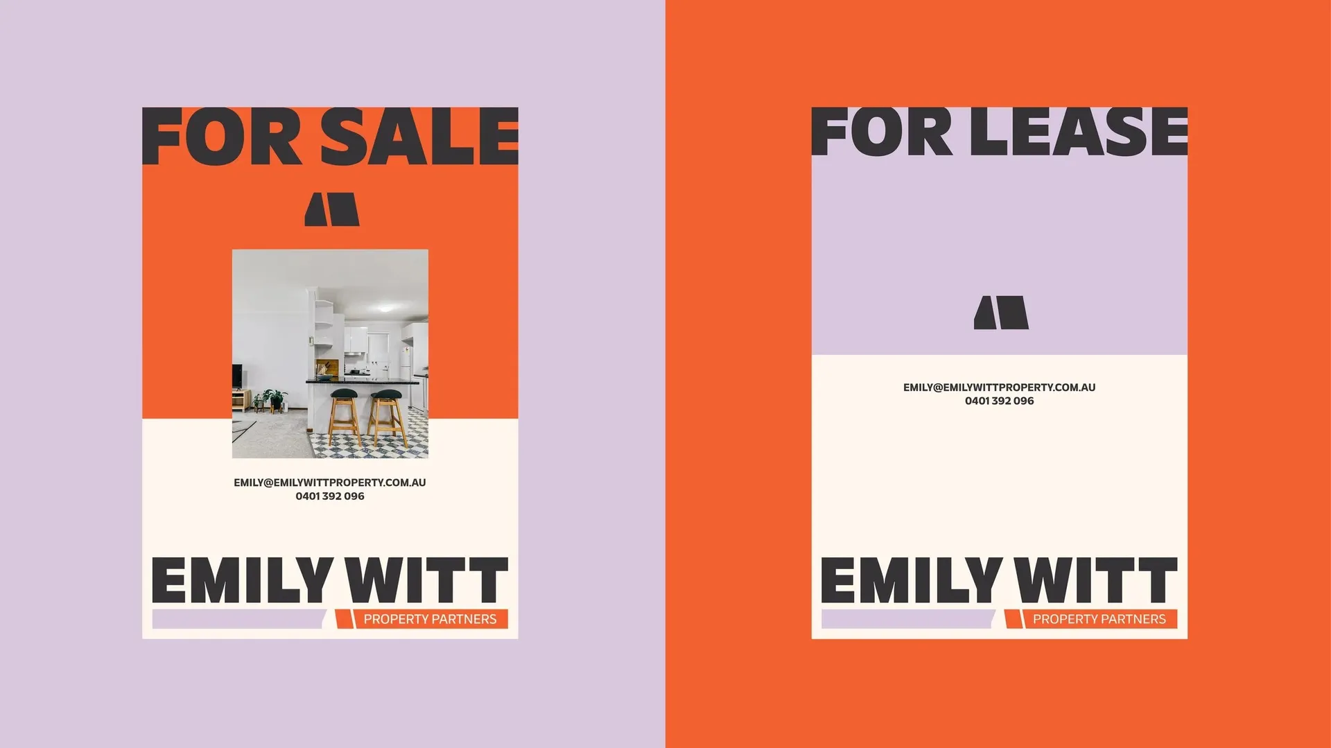
The icon was designed around the idea of filling a space, in this case, the shape was created by filling the space between Emily and Witt. The idea of filling a space represents the very thing the business stands for: filling spaces. Whether through property management or real estate, the brand is all about helping people find or fill the spaces they need.
The icon also symbolises connection, the bridge between renting and owning, buying and selling. It captures that moment of transition when clients move from one stage to the next.
Visually, the icon forms an architectural structure, reflecting the property industry. It’s intentionally simple and distinctive, designed to sit seamlessly alongside photography and other brand elements without distraction.
Its split form represents the two sides of the business, property management and sales, with colour variations helping to distinguish each area. Purple is used for management, reflecting a softer and more personal connection, while orange represents buying and selling, bold, eye-catching, and confident, just like the qualities you want in a real estate agent. Together, these colours create a clear and consistent visual cue across signage, print, and digital touchpoints.