About this project
Boz is a digital platform that lets people lend and borrow everyday items locally, tools, gear, and more.
We buy too much and borrow too little. From power tools to camping gear, most of us own expensive items that only get used once or twice before being tucked away to collect dust. That’s where Boz comes in. Boz is a digital platform that makes it easy to lend and borrow everyday items within your local community, from tools to gear and everything in between.
The Logo
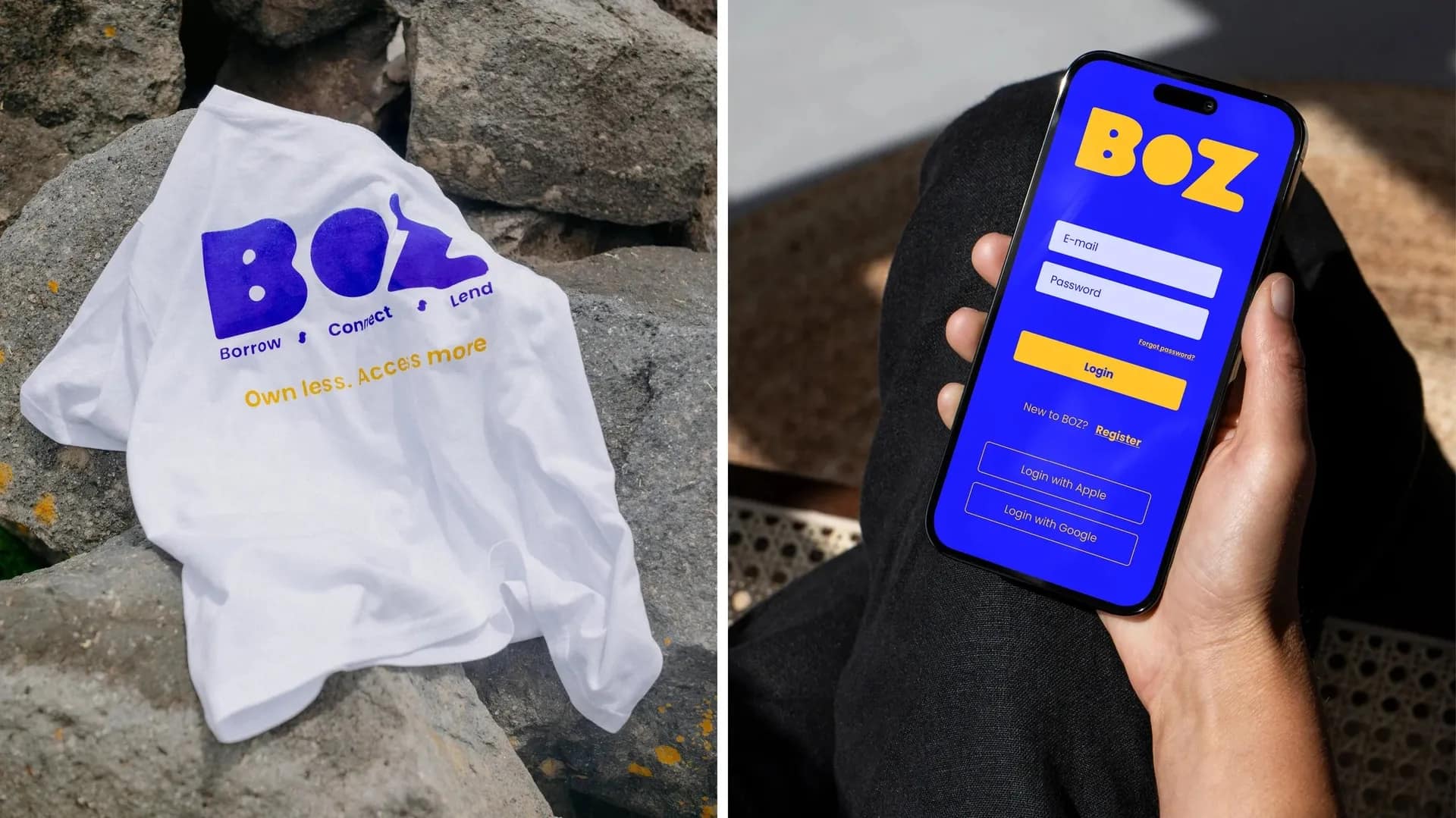
The Boz logo is a visual representation of the platform’s purpose. The B represents the borrower, the Z represents the lender, and the O in the centre symbolises the app itself, the bridge that connects them. The shape created where the B and Z are joined by the O represents that key moment of connection, where borrowing and lending meet through the BOZ platform.
The logo’s soft, rounded form is intentionally playful and approachable, reflecting Boz’s friendly and inclusive personality. This approachable tone will carry through in the brand’s voice. Boz is here for everyone, accessible, and grounded in community. The logo stands apart from competitors in the market, confidently carving out a fresh, welcoming identity.
Logos: Animation
This logo was designed with animation in mind. It begins with the full BOZ wordmark, which then seamlessly transitions into the brand mark and then the icon. This animation helps users visually understand the origin of the logo mark, reinforcing the connection between the name and the symbol from the very first interaction.
Logos: Brand Mark & Icon
The brand mark and app icon is what happens when the B and Z come together. From there, we can also see how it forms the secondary icon within the negative space within the brand mark.
Colours
The BOZ colour palette has been carefully chosen to strike a balance between warmth and innovation. The vibrant orange and yellow tones bring an inviting, energetic and playful feel to the brand. These hues communicate friendliness, optimism and accessibility, making BOZ feel like a brand that’s here for everyone. In contrast, the bold electric blue introduces a modern, tech-forward edge. It adds a sense of reliability, intelligence and confidence, which are essential qualities for a platform built around trust and connection.