Waitaha Canterbury Primary Mental Health Review
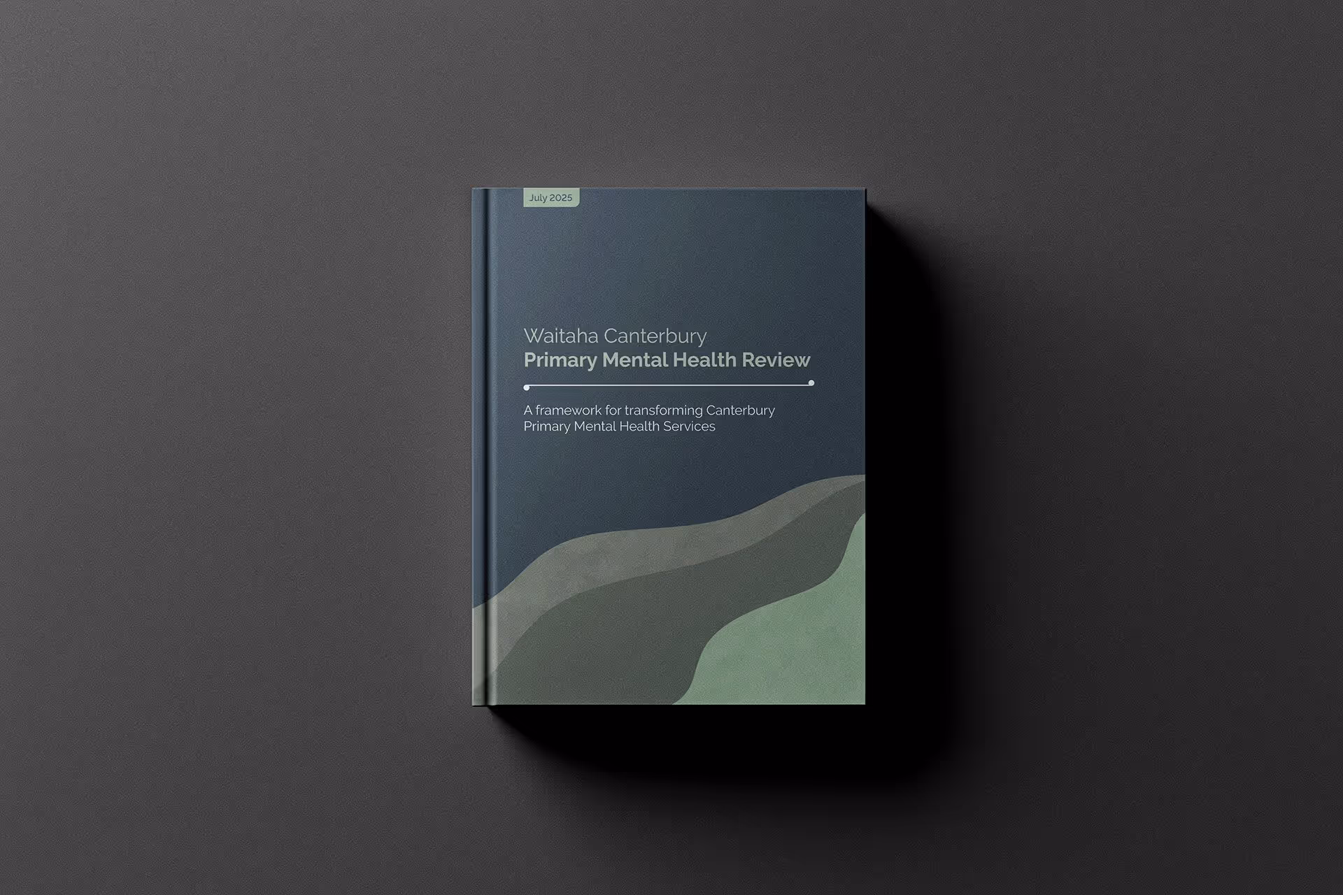


This project required a design approach that could hold a large volume of information — much of it complex and sometimes sensitive — with both clarity and empathy. The challenge was to communicate important insights in a way that respected the gravity of the subject matter while remaining approachable and human-centred. Through the considered use of colour and hand-drawn illustrations, the design achieved a sense of warmth and openness. These elements helped to soften the data-heavy content, making it more engaging and accessible for a wide audience, while still maintaining a professional and trustworthy tone. The result is a visual narrative that feels both informed and compassionate — reflective of the people and communities at the heart of the review.