Old Kips Apiaries Branding
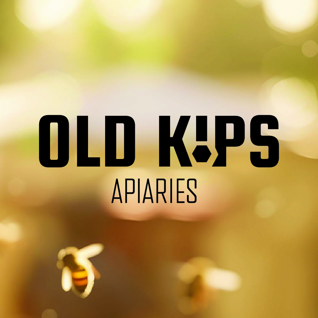


This rebrand for Old Kips Apiaries introduces a simple, clean, and masculine identity designed to feel strong, modern, and reliable. With a focus on clarity and impact, the brand reflects the honesty and craftsmanship of beekeeping through a bold and grounded visual language.
At the core of the identity is a robust sans serif logotype, built to feel enduring and confident. A honeycomb symbol is seamlessly integrated, offering a clear and recognisable nod to the craft while adding structure and distinction to the mark.
The palette is rich yet restrained, combining classic black and white with warm, creamy honey tones. This balance of strong contrast and natural warmth creates a refined, modern identity—one that feels both approachable and deeply connected to the purity and tradition of the product.